Revisiting Unemployment in Intermediate Macroeconomics: A New Approach for Teaching Diamond-Mortensen-Pissarides


About

This page contains resources to accompany the article Revisiting Unemployment in Intermediate Macroeconomics: A New Approach for Teaching Diamond-Mortensen-Pissarides by Arghya Bhattacharya, Paul Jackson, and Brian C Jenkins. In our article, we present a simplified version of the model of Diamond, Mortensen, and Pissarides' model of unemployment that is accessible to undergraduates and preserves the dynamic structure of the original model. For brevity, we refer to the model as the DMP model.

Below you will find a link to Beveridge curve data for the US, Python code used to produce the dataset, some sample emprical homework problems based on the Beveridge curve data, and a link to a web-based tool that students can use to analyze equilibrium in the DMP model.

Supplemental Materials

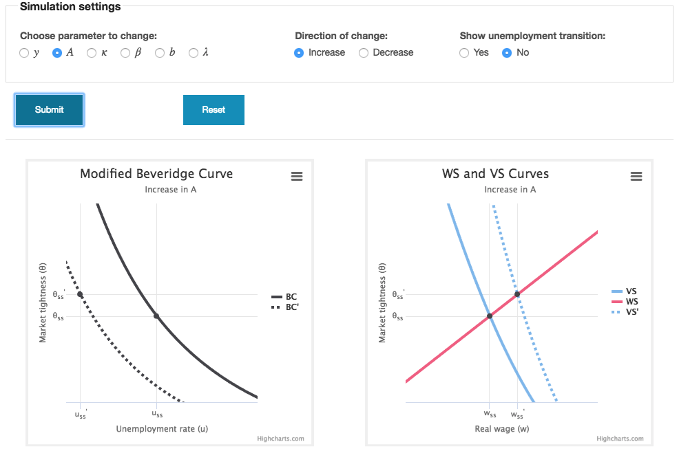
Beveridge Curve Data

In Figure 3 of our article, we present the following plot of Beveridge curve data for the US replicated from Petrosky-Nadeau and Zhang's (2014) article:

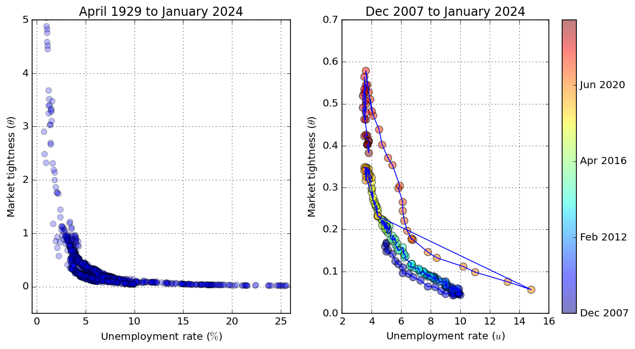
The figure is a plot of labor market tightness against the unemployment rate for the US for each month from April 1929 through September 2018. Market tightness is the ratio of job vacancies to unemployed persons. The downward-sloping relationship between market tightness and the unemployment rate is a key prediction of the DMP model and this figure provides important empirical justification for the model.

Simulation Tool

The DMP model has many moving parts and determining how the equilibrium adjusts following a change in an exogenous variable can be challenging at first. We've created a web-based simulation tool that students can use to practice working with the DMP model. The tool is available at the following URL:


The tool enables students to quickly perform counterfactual experiments within the DMP model. Students can choose which exogenous variable of the model they would like to change and how and then they can immediately see how the three curves of the model shift and how the steady state equilibrium changes. There is an option to see the dynamic transition of the unemployment rate to the new steady state. Furthermore, the figures produced by the tool are downloadable in several standard image formats that can be included in a homework assignment if so requested by an instructor. The image below is a screenshot of the tool in action: