fredpy Examples
[1]:
import pandas as pd
import numpy as np
import fredpy as fp
import matplotlib.pyplot as plt

# Use matplotlib's 'classic' style, set figure facecolor to white
plt.style.use('classic')
plt.rcParams.update({'figure.facecolor': 'white'})
Load API key
First apply for an API key for FRED here: https://research.stlouisfed.org/docs/api/api_key.html. The API key is a 32 character string that is required for making requests from FRED. Save your API key in the fp namespace by either setting the fp.api_key directly:
[2]:
fp.api_key = '################################'
or by reading from a text file containing only the text of the API key in the first line:
[3]:
fp.api_key = fp.load_api_key('fred_api_key.txt')
If fred_api_key.txt is not in the same directory as your program file, then you must supply the full path of the file.
Preliminary example
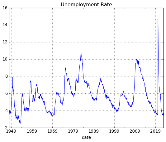
Downloading and plotting unemployment rate data for the US is easy with fredpy:
[4]:
fig = plt.figure()
u = fp.series('UNRATE')
plt.plot(u.data.index,u.data.values,'-',lw=3,alpha = 0.65)
plt.grid()
plt.ylabel('Percent');
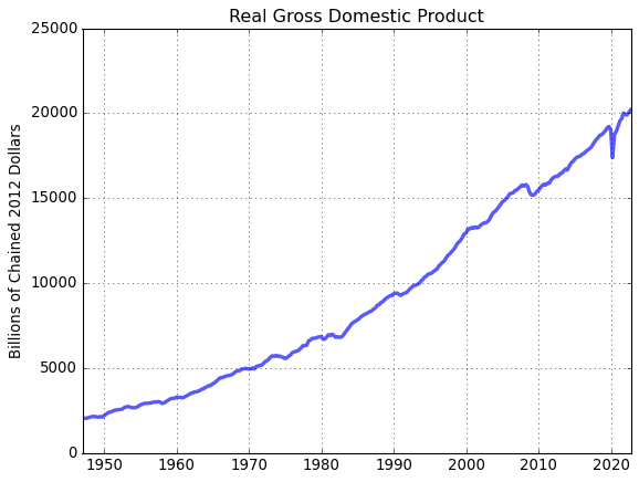
A closer look at fredpy using real GDP data
Use fredpy to download real GDP data. The FRED page for real GDP: https://fred.stlouisfed.org/series/GDPC1. Note that the series ID - GDPC1 - is in the URL and is visible in several places on the page.
The data in text format is located at: https://fred.stlouisfed.org/data/gdpc1.txt. When supplied with the series ID GDPC1, fredpy visits the the URL for the text-formatted data, reads the information on the page, and stores the data as attributes of a fredpy.series instance.
[5]:
# Download quarterly real GDP data using `fredpy`. Save the data in a variable called gdp
gdp = fp.series('gdpc1')

# Note that gdp is an instance of the `fredpy.series` class
print(type(gdp))
<class 'fredpy.series'>
Attributes
A fredpy.series instance stores information about a FRED series in 17 attribues:
data: (Pandas Series) - data values.
date_range: (string) - specifies the dates of the first and last observations.
frequency: (string) - data frequency. ‘Daily’, ‘Weekly’, ‘Monthly’, ‘Quarterly’, ‘Semiannual’, or ‘Annual’.
frequency_short: (string) - data frequency. Abbreviated. ‘D’, ‘W’, ‘M’, ‘Q’, ‘SA, or ‘A’.
last_updated: (string) - date series was last updated.
notes: (string) - details about series. Not available for all series.
observation_date: (string) – vintage date at which data are observed.
release: (string) - statistical release containing data.
seasonal_adjustment: (string) - specifies whether the data has been seasonally adjusted.
seasonal_adjustment_short: (string) - specifies whether the data has been seasonally adjusted. Abbreviated.
series_id: (string) - unique FRED series ID code.
source: (string) - original source of the data.
t: (int) - number corresponding to frequency: 365 for daily, 52 for weekly, 12 for monthly, 4 for quarterly, and 1 for annual.
title: (string) - title of the data series.
units: (string) - units of the data series.
units_short: (string) - units of the data series. Abbreviated.
[6]:
# Print the title, the units, the frequency, the date range, and the source of the gdp data
print(gdp.title)
print(gdp.units)
print(gdp.frequency)
print(gdp.date_range)
print(gdp.source)
Real Gross Domestic Product
Billions of Chained 2012 Dollars
Quarterly
Range: 1947-01-01 to 2022-10-01
U.S. Bureau of Economic Analysis
[7]:
# Print the last 4 values of the gdp data
print(gdp.data[-4:],'\n')
date
2022-01-01    19924.088
2022-04-01    19895.271
2022-07-01    20054.663
2022-10-01    20198.091
Freq: QS-OCT, Name: value, dtype: float64
[8]:
# Plot real GDP data
fig = plt.figure()
ax = fig.add_subplot(1,1,1)
ax.plot(gdp.data,'-',lw=3,alpha = 0.65)
ax.grid()
ax.set_title(gdp.title)
ax.set_ylabel(gdp.units);
Methods
A fredpy.series instance has 20 methods:
apc(log=False, backward=True)
as_frequency(freq=None,method=’mean’)
bp_filter(low=6, high=32, K=12)
cf_filter(low=6, high=32)
copy()
diff_filter()
divide(object2)
dropn_nan()
hp_filter(lamb=1600)
linear_filter()
log()
ma(length,center=False)
minus(object2)
pc(log=False, backward=True, annualized=False)
per_capita(total_pop=True)
plot(**kwargs)
plus(object2)
recent(N)
recessions(color=’0.5’, alpha = 0.5)
times(object2)
window(win)
The fredpy documentation has detailed explanations of the use of these methods: https://www.briancjenkins.com/fredpy/docs/build/html/series_class.html.
[9]:
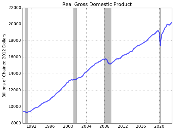
# Restrict GDP to observations from January 1, 1990 to present
win = ['01-01-1990','01-01-2200']
gdp_win = gdp.window(win)

# Plot
fig = plt.figure()
ax = fig.add_subplot(1,1,1)
ax.plot(gdp_win.data,'-',lw=3,alpha = 0.65)
ax.grid()
ax.set_title(gdp_win.title)
ax.set_ylabel(gdp_win.units)

# Plot recession bars
gdp_win.recessions()
[10]:
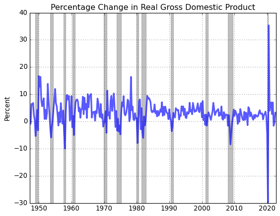
# Compute and plot the (annualized) quarterly growth rate of real GDP
gdp_pc = gdp.pc(annualized=True)

# Plot
fig = plt.figure()
ax = fig.add_subplot(1,1,1)
ax.plot(gdp_pc.data,'-',lw=3,alpha = 0.65)
ax.grid()
ax.set_title(gdp_pc.title)
ax.set_ylabel(gdp_pc.units)

# Plot recession bars
gdp_pc.recessions()
[11]:
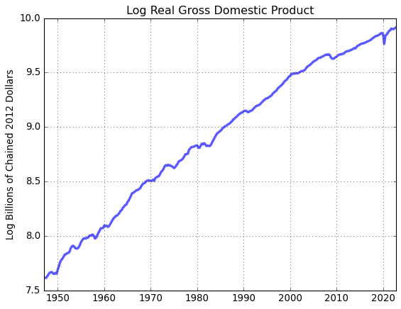
# Compute and plot the log of real GDP
gdp_log = gdp.log()

# Plot
fig = plt.figure()
ax = fig.add_subplot(1,1,1)
ax.plot(gdp_log.data,'-',lw=3,alpha = 0.65)
ax.set_title(gdp_log.title)
ax.set_ylabel(gdp_log.units)
ax.grid()
More examples
The following examples demonstrate some additional fredpy functionality.
Comparison of CPI and GDP deflator inflation
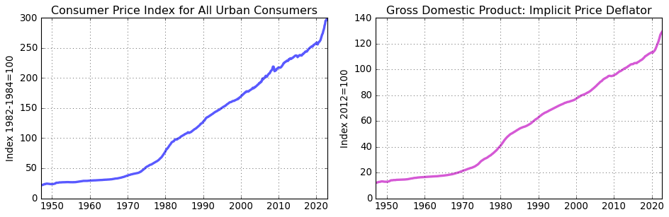
CPI data are released monthly by the BLS while GDP deflator data are released quarterly by the BEA. Here we’ll first convert the monthly CPI data to monthly frequency compute inflation as the percentage change in the respective index since on year prior.
[12]:
# Download CPI and GDP deflator data
cpi = fp.series('CPIAUCSL')
deflator = fp.series('GDPDEF')

fig = plt.figure(figsize=(12,4))
ax = fig.add_subplot(1,2,1)
ax.plot(cpi.data,'-',lw=3,alpha = 0.65)
ax.grid()
ax.set_title(cpi.title.split(':')[0])
ax.set_ylabel(cpi.units)

ax = fig.add_subplot(1,2,2)
ax.plot(deflator.data,'-m',lw=3,alpha = 0.65)
ax.grid()
ax.set_title(deflator.title)
ax.set_ylabel(deflator.units)

# Imporove use of whitespace
fig.tight_layout()
[13]:
# The CPI data are produced at a monthly frequency
print(cpi.frequency)

# Convert CPI data to quarterly frequency to conform with the GDP deflator
cpi_Q = cpi.as_frequency(freq='Q')
print(cpi_Q.frequency)
Monthly
Quarterly
[14]:
# Compute the inflation rate based on each index
cpi_pi = cpi_Q.apc()
def_pi = deflator.apc()

# Print date ranges for new inflation series
print(cpi_pi.date_range)
print(def_pi.date_range)
Range: 1948-01-01 to 2022-10-01
Range: 1948-01-01 to 2022-10-01
[15]:
fig = plt.figure(figsize=(6,4))
ax = fig.add_subplot(1,1,1)
ax.plot(cpi_pi.data,'-',lw=3,alpha = 0.65,label='cpi')
ax.plot(def_pi.data,'-',lw=3,alpha = 0.65,label='def')
ax.legend(loc='upper right')
ax.set_title('US inflation')
ax.set_ylabel('Percent')
ax.grid()
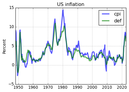
Even though the CPI inflation rate is on average about .3% higher the GDP deflator inflation rate, the CPI and the GDP deflator produce comparable measures of US inflation.
Equalizing date ranges of different series
Often data series have different observation ranges. The fredpy.window_equalize() function provides a quick way to set the date ranges for multiple series to the same interval.
[16]:
# Download unemployment and 3 month T-bill data
unemp = fp.series('UNRATE')
tbill_3m = fp.series('TB3MS')

# Print date ranges for series
print(unemp.date_range)
print(tbill_3m.date_range)

# Equalize the date ranges
unemp, tbill_3m = fp.window_equalize([unemp, tbill_3m])

# Print the new date ranges for series
print()
print(unemp.date_range)
print(tbill_3m.date_range)
Range: 1948-01-01 to 2023-01-01
Range: 1934-01-01 to 2023-01-01

Range: 1948-01-01 to 2023-01-01
Range: 1948-01-01 to 2023-01-01
Filtering 1: Extracting business cycle components from quarterly data with the HP filter
[17]:
# Download nominal GDP, the GDP deflator

gdp = fp.series('GDP')
defl = fp.series('GDPDEF')

# Make sure that all series have the same window of observation
gdp,defl = fp.window_equalize([gdp,defl])

# Deflate GDP series
gdp = gdp.divide(defl)

# Convert GDP to per capita terms
gdp = gdp.per_capita()

# Take log of GDP
gdp = gdp.log()
[18]:
# Plot log data
fig = plt.figure(figsize=(6,4))

ax1 = fig.add_subplot(1,1,1)
ax1.plot(gdp.data,'-',lw=3,alpha = 0.65)
ax1.grid()
ax1.set_title('log real GDP per capita')
gdp.recessions()
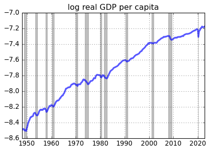
The post-Great Recession slowdown in US real GDP growth is apparent in the figure.
[19]:
# Compute the hpfilter
gdp_cycle, gdp_trend = gdp.hp_filter()
[20]:
# Plot log data
fig = plt.figure(figsize=(6,8))
ax1 = fig.add_subplot(2,1,1)
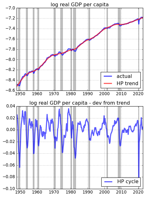
ax1.plot(gdp.data,'-',lw=3,alpha = 0.7,label='actual')
ax1.plot(gdp_trend.data,'r-',lw=3,alpha = 0.65,label='HP trend')
ax1.grid()
ax1.set_title('log real GDP per capita')
gdp.recessions()
ax1.legend(loc='lower right')
fig.tight_layout()
ax1 = fig.add_subplot(2,1,2)
ax1.plot(gdp_cycle.data,'b-',lw=3,alpha = 0.65,label='HP cycle')
ax1.grid()
ax1.set_title('log real GDP per capita - dev from trend')
gdp.recessions()
ax1.legend(loc='lower right')
# Imporove use of whitespace
fig.tight_layout()
Filtering 2: Extracting business cycle components from monthly data
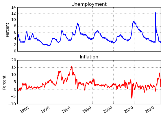
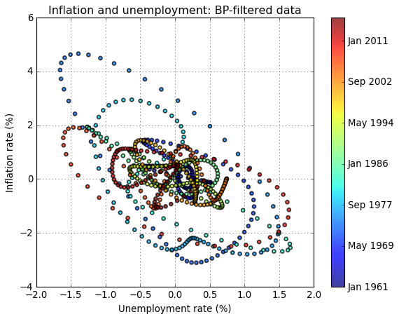
In Figure 1.5 from The Conquest of American Inflation, Thomas Sargent compares the business cycle componenets (BP filtered) of monthly inflation and unemployment data for the US from 1960-1982. Here we replicate Figure 1.5 to include the most recently available data and we also consturct the figure using HP filtered data.
[21]:
u = fp.series('LNS14000028')
p = fp.series('CPIAUCSL')

# Construct the inflation series
p = p.pc(annualized=True)
p = p.ma(length=6,center=True)

# Make sure that the data inflation and unemployment series cver the same time interval
p,u = fp.window_equalize([p,u])

# Data

fig = plt.figure()
ax = fig.add_subplot(2,1,1)
ax.plot(u.data,'b-',lw=2)
ax.grid(True)
ax.set_title('Unemployment')
ax.set_ylabel('Percent')

ax = fig.add_subplot(2,1,2)
ax.plot(p.data,'r-',lw=2)
ax.grid(True)
ax.set_title('Inflation')
ax.set_ylabel('Percent')

fig.autofmt_xdate()
[22]:
# Filter the data
p_bpcycle,p_bptrend = p.bp_filter(low=24,high=84,K=84)
u_bpcycle,u_bptrend = u.bp_filter(low=24,high=84,K=84)

# Scatter plot of BP-filtered inflation and unemployment data (Sargent's Figure 1.5)
fig = plt.figure()
ax = fig.add_subplot(1,1,1)
t = np.arange(len(u_bpcycle.data))
plt.scatter(u_bpcycle.data,p_bpcycle.data,facecolors='none',alpha=0.75,s=20,c=t, linewidths=1.5)
ax.set_xlabel('Unemployment rate (%)')
ax.set_ylabel('Inflation rate (%)')
ax.set_title('Inflation and unemployment: BP-filtered data')
ax.grid(True)

cbar = plt.colorbar(ax = ax)
cbar.set_ticks([int(i) for i in cbar.get_ticks()[:-1]])
cbar.set_ticklabels([p_bpcycle.data.index[int(i)].strftime('%b %Y') for i in cbar.get_ticks()[:]])
[23]:
# HP filter
p_hpcycle,p_hptrend = p.hp_filter(lamb=129600)
u_hpcycle,u_hptrend = u.hp_filter(lamb=129600)

# Scatter plot of HP-filtered inflation and unemployment data (Sargent's Figure 1.5)
fig = plt.figure()
ax = fig.add_subplot(1,1,1)
t = np.arange(len(u_hpcycle.data))
plt.scatter(u_hpcycle.data,p_hpcycle.data,facecolors='none',alpha=0.75,s=20,c=t, linewidths=1.5)
ax.set_xlabel('Unemployment rate (%)')
ax.set_ylabel('Inflation rate (%)')
ax.set_title('Inflation and unemployment: HP-filtered data')
ax.grid(True)

cbar = plt.colorbar(ax = ax)
cbar.set_ticks([int(i) for i in cbar.get_ticks()[:-1]])
cbar.set_ticklabels([p_hpcycle.data.index[int(i)].strftime('%b %Y') for i in cbar.get_ticks()[:]])
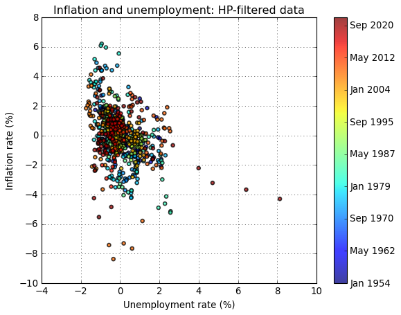
The choice of filterning method appears to strongly influence the results. While both filtering methods produce a downward-sloping relationship between inflation and unemployment, the relationship is more pronounced in the BP-filtered data.
Vintage Data
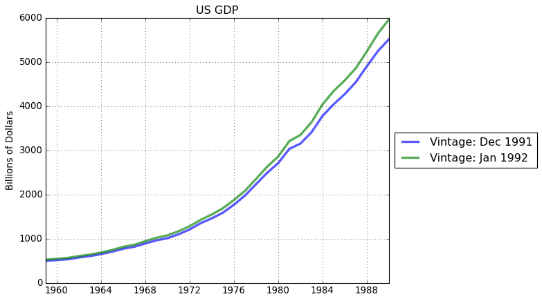
Data are updated and ALFRED, ArchivaL Federal Reserve Economic Data, stores historical data versions. Use get_vintage_dates() to find the avilable vintage dates for a FRED series. For example, let’s consider US GDP data.
[24]:
# Get all available vintages
gdp_vintage_dates = fp.get_vintage_dates('GDPA')

print('Number of vintages available:',len(gdp_vintage_dates))
print('Oldest vintage:              ',gdp_vintage_dates[0])
print('Most recent vintage:         ',gdp_vintage_dates[1])
Number of vintages available: 342
Oldest vintage:               1991-12-04
Most recent vintage:          1992-01-29
From the available vintage dates, use the observation_date keyword in series() to download a desired vintage. For example, download and plot the oldest available and most recent US GDP data.
[25]:
# Download oldest available GDP data
gdp_old = fp.series('GDPA',observation_date = gdp_vintage_dates[0])

# Download most recently available GDP data
gdp_cur = fp.series('GDPA',observation_date = gdp_vintage_dates[-1])

# Equalize date ranges
gdp_old, gdp_cur = fp.window_equalize([gdp_old, gdp_cur])


# Plot
fig = plt.figure()
ax = fig.add_subplot(1,1,1)
ax.plot(gdp_old.data,lw=3,alpha = 0.65,label=pd.to_datetime(gdp_vintage_dates)[0].strftime('Vintage: %b %Y'))
ax.plot(gdp_cur.data,lw=3,alpha = 0.65,label=pd.to_datetime(gdp_vintage_dates)[1].strftime('Vintage: %b %Y'))
ax.set_ylabel(gdp_cur.units)
ax.legend(loc='center left', bbox_to_anchor=(1, 0.5))
ax.set_title('US GDP')
ax.grid()
Exporting data sets
Exporting data inported with fredpy to csv files is easy with Pandas.
[26]:
# create a Pandas DataFrame
df = pd.DataFrame({'inflation':p.data,
                    'unemployment':u.data},)

print(df.head())

# Export to csv
df.to_csv('data.csv')
            inflation  unemployment
date
1954-01-01   0.338565           3.6
1954-02-01  -0.625714           3.8
1954-03-01   0.630199           4.1
1954-04-01   0.555030           4.7
1954-05-01  -0.557835           4.6
Custom API querries
The FRED API allows for more specific querries than what is available through the basic fredpy functionality. Read more about allowable querries to the API here: https://fred.stlouisfed.org/docs/api/fred/
In the cell below, I demonstrate how to manually retrieve unemployment data using the fredpy.fred_api_request() function.
[27]:
import datetime

# Specify the API path
path = 'fred/series/observations'

# Set observation_date string as today's date
observation_date = datetime.datetime.today().strftime('%Y-%m-%d')

# Specify desired parameter values for the API querry
parameters = {'series_id':'unrate',
  'observation_date':observation_date,
  'file_type':'json'
 }

# API request
r = fp.fred_api_request(api_key=fp.api_key,path=path,parameters=parameters)

# Return results in JSON forma
results = r.json()

# Load data, deal with missing values, format dates in index, and set dtype
data = pd.DataFrame(results['observations'],columns =['date','value'])
data = data.replace('.', np.nan)
data['date'] = pd.to_datetime(data['date'])
data = data.set_index('date')['value'].astype(float)

# Plot the unemployment rate
data.plot()
plt.title('Unemployment Rate')
plt.grid()